Estate #8 Paper Labels
Estate #8 is a bright white premium label paper from Neenah’s Estate Label collection with a vellum finish. It provides the cleanest, brightest appearance of the three Estate papers while retaining the character of an uncoated premium paper.
Rectangle · 2" × 3" · Estate #8 · Qty 1,000
What is Estate #8 Paper?
Estate #8 is a premium uncoated label paper from Neenah’s Estate Label collection: bright white, approximately 89 brightness, with a smooth vellum finish. It’s built as a wet-strength paper for label applications exposed to moisture — wet strength helps the label resist tearing or shriveling in damp conditions, but it is not the same thing as waterproof.
Compared to Estate #4 and Estate #9’s laid texture, Estate #8’s vellum finish is smoother and cleaner, while still reading as an uncoated premium paper rather than a coated stock like Semi-Gloss.

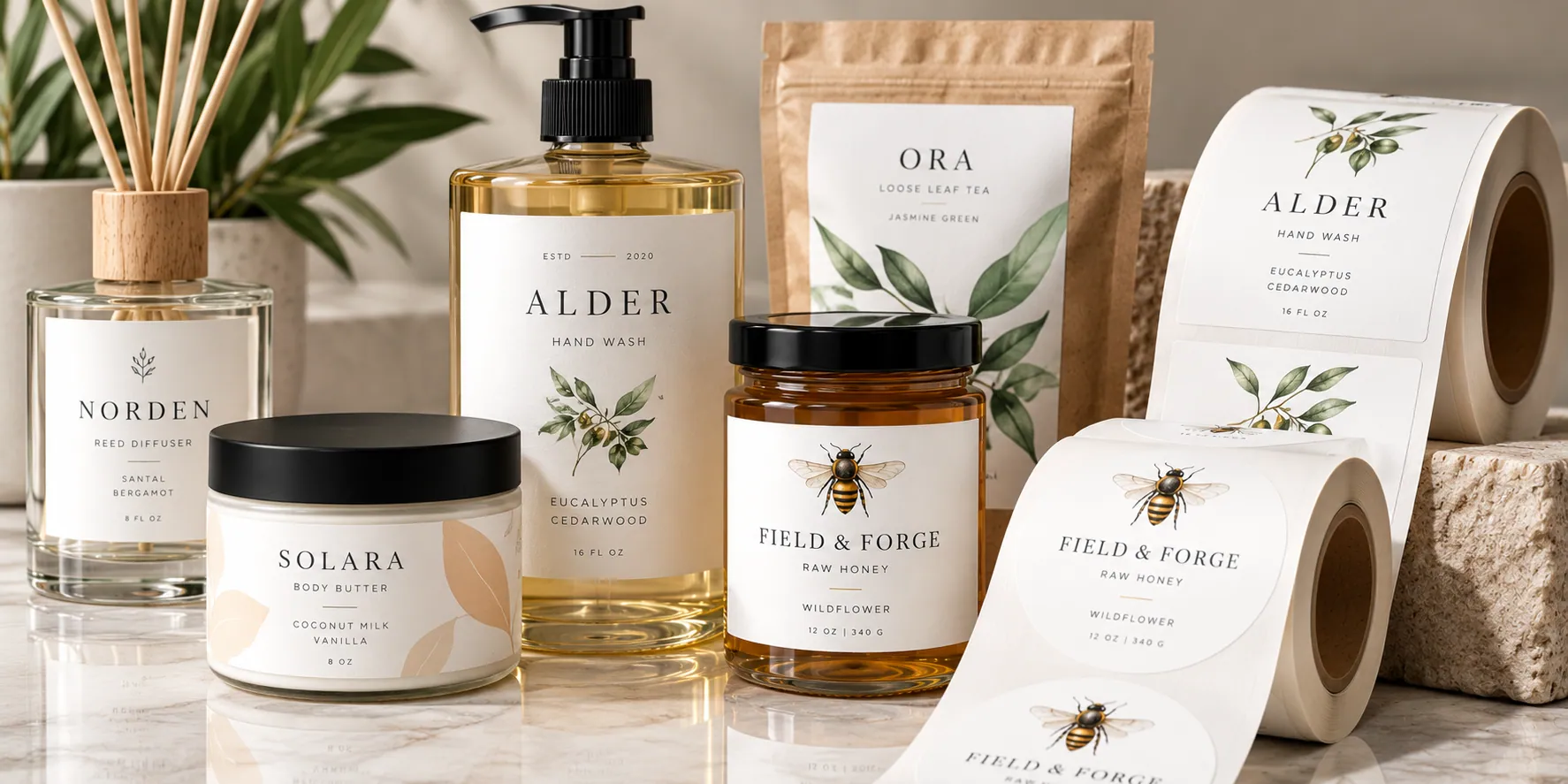
Quick specs
Specifications as published by the manufacturer. Wet strength describes resistance to moisture-related tearing or shriveling — it does not mean the finished label is waterproof.
Why choose Estate #8?
The cleanest, brightest Estate paper
Of the three Estate papers, #8 has the brightest base and the smoothest surface, while still reading as an uncoated premium paper rather than a coated stock.
Vellum is a finish, not a texture
The vellum finish is smoother and less pronounced than Estate #4 or #9's laid texture — "vellum" describes the surface finish here, not transparency.
Why brightness matters
A brighter white base gives printed colors a more neutral, consistent starting point than a warmer or more textured paper.
Where it works well
Wine Labels
A clean, bright premium paper option for bottle presentation. See Wine Labels →
Beverage Labels
Works well where color accuracy on the label matters. See Beverage Labels →
Cosmetic Labels
For beauty and personal care packaging that calls for a clean, bright paper look. See Cosmetic Labels →
Spirits Labels
A premium uncoated option when the design calls for a brighter base than the laid Estate papers. See Spirits Labels →
Available finishes
Estate #8 is currently offered as a bare stock. Lamination, foil, and Spot UV aren’t currently offered for this material. If that changes, we’ll update this page and the calculator.
Popular sizes
2" × 3"
A versatile size for jars, bottles and smaller packaging.3" × 5"
More room for branding and product information.4" × 6"
For larger containers, boxes and packaging.6" × 9"
For larger packaging and wraparound applications.Custom size or shape
Need something different? Choose a custom size or die-cut shape in the calculator.Estate #8 vs. Semi-Gloss Paper
Both have a relatively clean appearance, but one is a coated paper and the other is an uncoated premium paper.
Want a more pronounced texture? See Estate #4 Paper Labels → · Want a warmer paper color? See Estate #9 Paper Labels →
Artwork considerations
Brightness gives colors a neutral base
The bright white, approximately 89-brightness base gives printed artwork a more neutral starting point than a warmer or cream stock.
Vellum reads smoother than laid
Fine detail and type generally read cleaner on Estate #8's vellum finish than on Estate #4 or #9's more pronounced laid texture.
Keep important content inside the cut line
Keep text, logos and other important elements safely inside the finished edge of the label.
You'll see a proof first
Every order receives a digital proof before production so you can review the artwork before it moves forward.
Estate #8 Paper Labels: frequently asked questions
Ready to build your Estate #8 labels?
Choose your size, shape and available options in the calculator to see pricing for your configuration.