Estate #9 Paper Labels
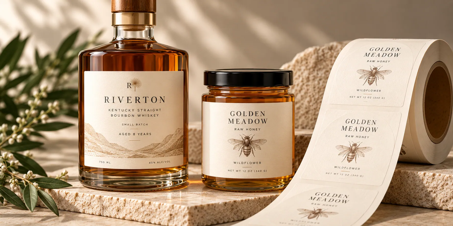
Estate #9 is a warm cream label paper from Neenah’s Estate Label collection with a classic laid texture. The natural cream face stock becomes part of the design, giving printed labels a softer, more traditional appearance than a bright white paper.
Rectangle · 2" × 3" · Estate #9 · Qty 1,000
What is Estate #9 Paper?
Estate #9 is a premium uncoated label paper from Neenah’s Estate Label collection: a warm cream color with a classic laid finish. Unlike Estate #4 and #8, the base color itself is part of the visual effect — printed artwork sits on a cream surface rather than a white one. It’s built as a wet-strength paper for label applications exposed to moisture — wet strength helps the label resist tearing or shriveling in damp conditions, but it is not the same thing as waterproof.
Because the stock itself is cream, printed colors will not look the same as they would on a white or bright white paper. We can’t promise an exact color match to how the same artwork prints on a different substrate.

Quick specs
Specifications as published by the manufacturer. Wet strength describes resistance to moisture-related tearing or shriveling — it does not mean the finished label is waterproof.
Why choose Estate #9?
A warmer, more natural base
The cream face stock becomes part of the design, giving printed labels a softer, more traditional appearance than a bright white paper.
Classic laid texture
Like Estate #4, Estate #9 has a visible laid texture — but in a cream base rather than white.
Built for heritage and natural-feeling designs
Works well when the brand direction calls for a softer, more traditional paper color rather than a bright white or synthetic look.
Where it works well
Wine Labels
A warm, traditional paper option for bottle presentation. See Wine Labels →
Spirits Labels
Works well for heritage-style branding and natural design direction. See Spirits Labels →
Food Labels
A premium paper option for gourmet and specialty food packaging with a natural look. See Food Labels →
Candle Labels
A warm, textured paper option for candle vessels and packaging. See Candle Labels →
Available finishes
Estate #9 is currently offered as a bare stock. Lamination, foil, and Spot UV aren’t currently offered for this material. If that changes, we’ll update this page and the calculator.
Popular sizes
2" × 3"
A versatile size for jars, bottles and smaller packaging.3" × 5"
More room for branding and product information.4" × 6"
For larger containers, boxes and packaging.6" × 9"
For larger packaging and wraparound applications.Custom size or shape
Need something different? Choose a custom size or die-cut shape in the calculator.Estate #9 vs. Estate #4 vs. Estate #8
All three are Neenah Estate Label papers, but the color and surface are genuinely different.
Want the same laid texture in white? See Estate #4 Paper Labels → · Want the brightest, smoothest option? See Estate #8 Paper Labels →
Artwork considerations
White in your artwork won't print bright white
Because the underlying stock is cream, not white, any white or very light areas in your design will take on the paper's natural cream tone rather than appearing bright white.
Colors shift warmer
Printed colors sit on top of a cream base rather than a neutral white one, so the finished result will read warmer than the same artwork printed on a white or bright white stock. We can't promise an exact color match to how the same file looks on White PP or Estate #8.
The laid texture is part of the look
Like Estate #4, the surface texture remains visible in the finished label and becomes part of how the artwork reads.
You'll see a proof first
Every order receives a digital proof before production so you can review the artwork before it moves forward.
Estate #9 Paper Labels: frequently asked questions
Ready to build your Estate #9 labels?
Choose your size, shape and available options in the calculator to see pricing for your configuration.